
Redrawing My 'Fable' Fan-map from 5 Years Ago
A study in how my art style has evolved (and efforts to make sense of the Fable maps)

Intro
Well, this ended up being longer than I anticipated! I’ll keep it brief here: I’ve been drawing maps on commission for almost five years now, so I thought it’d be a good time to do a retrospective. I didn’t want to redraw an old commission, though, because those belong to the people who paid for them - and it wouldn’t feel right to ‘improve’ an old map that someone paid for only to compare it to a newer and (hopefully) better version.
Fortunately, in 2020 I drew a fan-map of the Fable universe, which I of course own no copyright to, so that gives me something to use!
I’m going to dig into the source material - the maps from the Fable games - and then to a little comparison of my original map versus the one I’ve just finished. Let’s get into it.
The source material
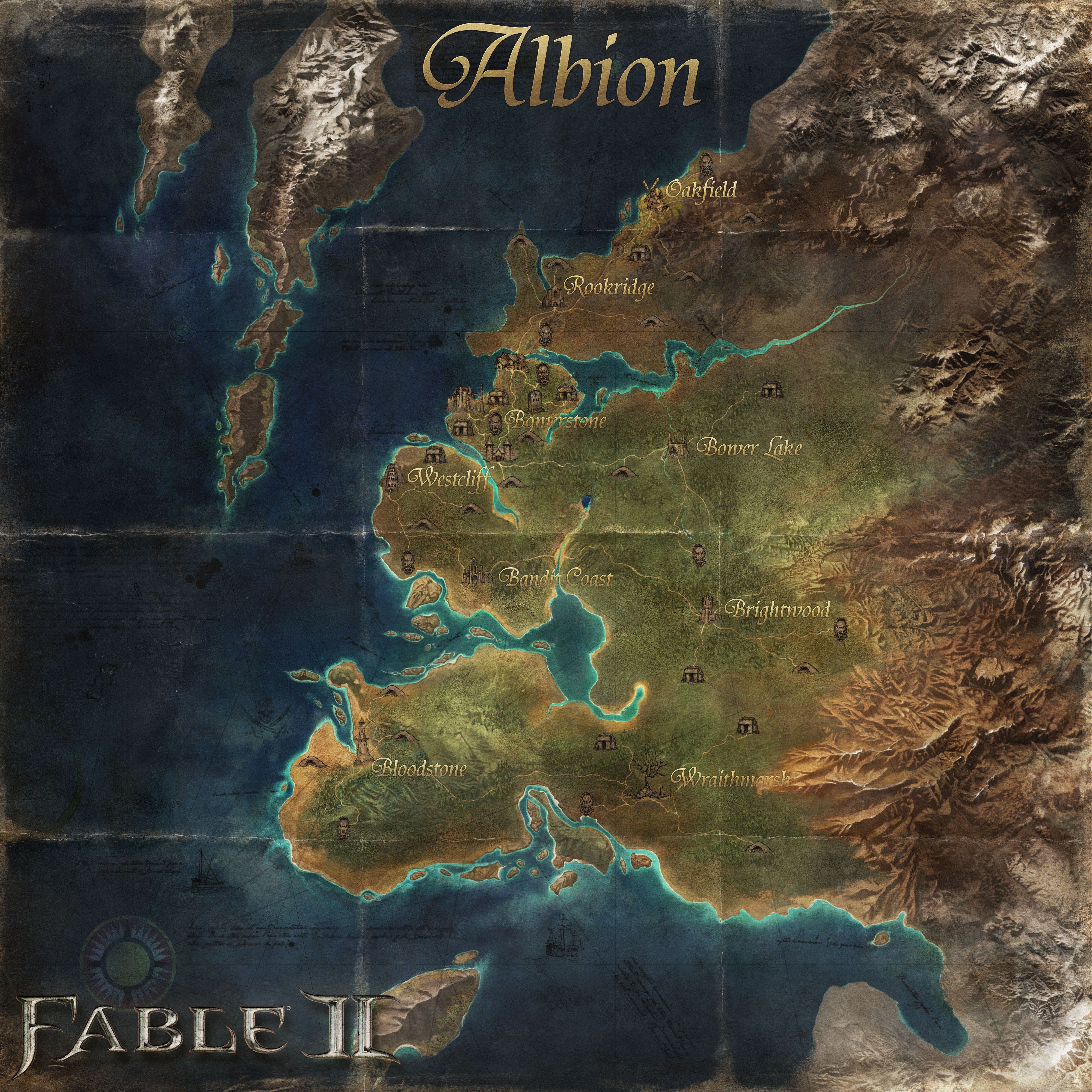
Fable 1

I’m starting with this map, which is paradoxically the oldest and newest map in the franchise (being made first for Fable 1 but updated and redone for the Fable: Anniversary remaster). It is the most map-like of the Fable maps, and actually has routes, forests, locations, rivers etc all clearly visible. This gives us good bones to work from - especially regarding the rivers, which are sorely lacking in the later maps. However, I see this as being a map of a distant past, a time considered almost fictional by the era of the later Fable games, when industry has come to Albion (the tme when my fictional in-world cartographer is drawing). It’s a vision of Albion at its most beautiful, more art than cartography.
NOTE FROM FUTURE DEWI: To my shame, I dismissed the glyphs on the left side of the Fable: Anniversary map; they actually contain a coded message that a fan forum, The Dead Hamster, decoded back in 2014. You can see the full map (glyphs included) here, and you can read the decoded message in full here.
The coded message is obviously a hidden joke, but it gives us information too: the character who drew Albion’s first map was John Speed, who was killed in a duel before it could be published. The message also claims that although the map is the most accurate piece of Albion mapmaking, there are “many doubts cast on its accuracy”. Specifically, it “is drawn smaller than the real world”, and “Forests, hills and monsters aren’t to scale neither and some stuff might’ve been added where they actually aren’t. Oh and the river at the bottom is probably a beer stain.”
It’s a tongue-in-cheek bit of fun on the developers’ part about the discrepancies between the games’ maps, especially the vanishing southern rivers. The message also mentions that Albion has its own Cartographers Guild!
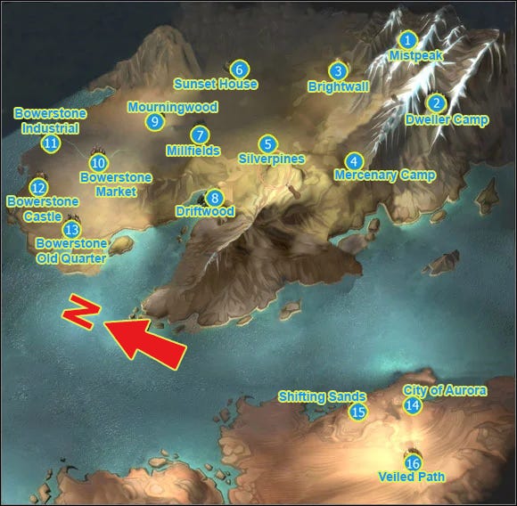
Fable 2
Our second source is the Fable 2 map, which is probably the prettiest, but less useful than the first. You also get a glimpse at the inconsistent world over the course of the series. Those rivers down in the south on the first map? Nowhere to be seen now. The mountains between Bloodstone and Wraithmarsh have similarly vanished. The peninsula north of Gibbet Woods (on the previous map) is still there, but the Bargate Prison island has disappeared. Most infuriatingly of all for me, though, as someone who feels strongly about rivers doing the right thing on maps, is that the river that once fed into Greatwood Lake from those vanished mountains now flows directly into the sea from the lake, near the Bandit Coast. *sigh*.
What do we make of these discrepancies? Well, hold on, because there’s one more major map to look at.
*tenses in anticipation*
Fable 3
Ah, the Fable 3 map. How you provoke strong opinions, mostly in the negative category.
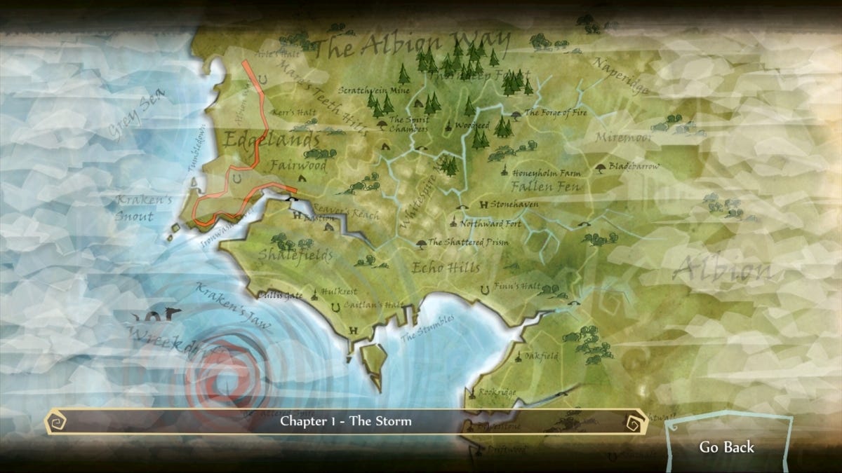
Search online for a map of the Fable 3 world and you’ll struggle to find a good one, largely because there really isn’t one. Instead, there’s an in-game interactive map (sort of in the style of Skyrim) that I… actually like. It’s fun and easy to use and even has little things moving around if you zoom in close enough. It feels like the sort of magical map a fantasy king would use to survey his kingdom… which is exactly what it is, and I love that. But for our purposes, it is totally awful.
I was fully prepared to have to make an expedition into the game to find some decent images to use, but fortunately I found this one on gamepressure.com, so thank you to them - and here’s a link to the source page out of courtesy. I’ve added my own text labels and a compass marker for clarity.
At first glance, the map bears almost no resemblance to previous Fable maps at all. Realising which direction north is - which the game doesn’t tell you - helps us slot it together a little better, and some clues in game help, too. For instance, it’s not unreasonable to assume that Brightwall town would be near the old label of Brightwood - and indeed, at the very far end of the Silverpines space in-game you can see the ruins of Brightwall Tower in the distance, suggesting that Brightwood is between Brightwall and Silverpines, even though it doesn’t appear on this map.
That peninsula beneath Driftwood, then, becomes the place where Bloodstone is on the Fable 2 map, and its shape is similar to the peninsula at the southern end of the Fable 1 map, so this is probably the same landmass on all three maps. Millfields is the new name for Bower Lake, which in turn was the old Heroes Guild from the first map. It starts to make a weird, kaleidoscopic kind of sense.
So how do we piece all this together?
Wait. I’m forgetting something.
Damn it.
Fable: The Journey
There’s also this map from that other Fable game.
Honestly I wouldn’t be surprised if this ends up being written out of the canon entirely considering how the game landed. But for our purposes, it’s useful for filling out northern edges of the map that would otherwise be empty, and it helps confirm the placements of Oakfield, Rookridge, Bowerstone, Driftwood and Brightwall (all at the southern extremity). I watched a playthrough recently and noticed that Theresa referred to both Greatwood and Brightwood in the same sentence, so that dismisses the theory that Greatwood became Brightwood in the 500 years between Fables 1 and 2.
That’s enough about that.
My Fable maps
The 2020 one
Here’s my original Fable fan-map. I made it towards the end of 2020 if I remember rightly, which means it was almost the start of my illustration career. (I’d been drawing maps for fun beforehand for years, but only started working at this professionally in summer 2020.)
It’s odd to look back on because it doesn’t feel long ago, but my tools have entirely changed since then. When I drew this, a youngster with no money in the throes of Covid-lockdown times, I had… basically zero money. Which means I was drawing using a mouse and keyboard on a PC I bought in 2013. Yes, a mouse and keyboard. I don’t know how I didn’t get carpal tunnel or something.
Those mountains and forests were actually drawn by hand with pen and paper, then scanned so I could use them as Photoshop stamps. I can’t fault old me for effort and enthusiasm, but the map is a little lacking. I had no real concept of composition then - how to make the different elements of the piece work well as a whole - so there’s no border, and that attempt at a title plate in the top left isn’t great. I can see I’d worked out that differing font sizes and styles between city-level labels and regional labels tends to look good, but the fonts could be better chosen. And of course the parchment-style texture across the whole map is very basic.
I think I sold one physical print of this map - for £10, not including production and delivery costs. So yeah. Start small, I guess?
What amazes me is that at the time, I thought this was the best map I could possibly make. I couldn’t see any way to improve. It’s true that practice makes you better, and even if you can’t see it day by day, when you compare over years, the difference can be stark.
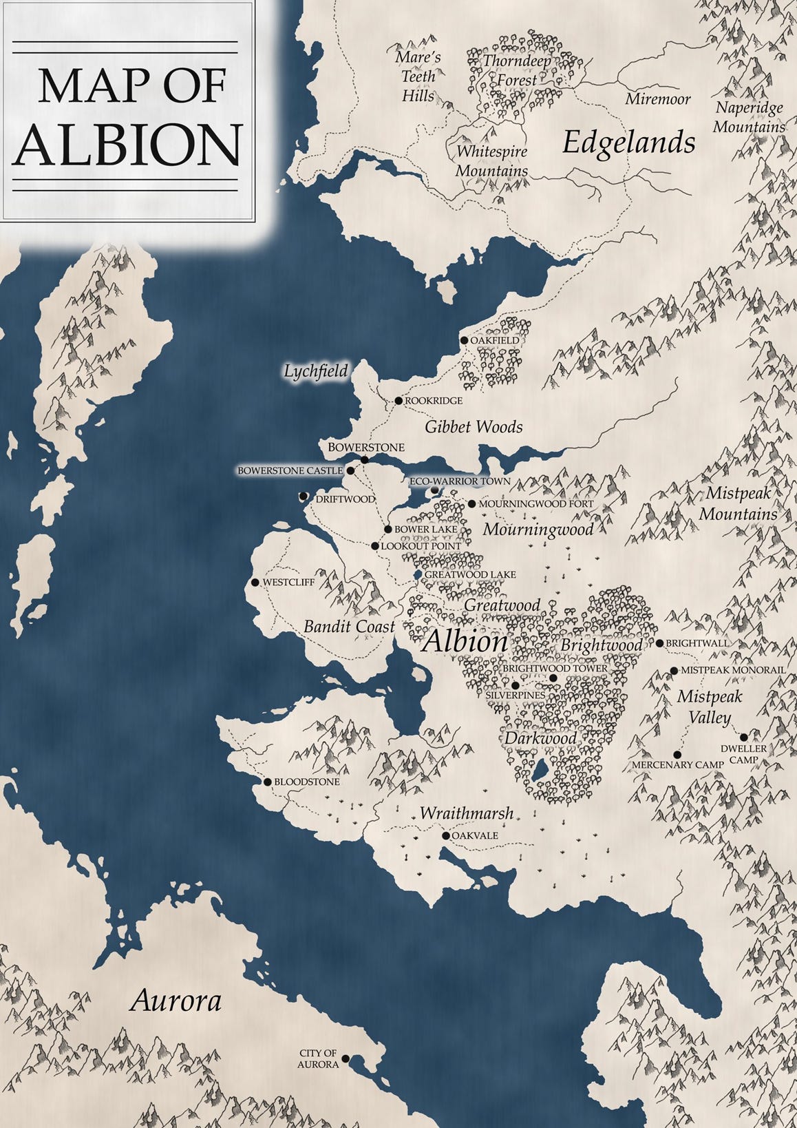
The 2025 one

Most of my maps are for the publishing industry, so they’re designed to go on either single- or double-page spreads most of the time, which is where my composition skills are strongest. I’ve designed this as though it would be printed on a single 6x9inch page.
The first thing I notice is that the scale feels wildly different. By sizing up the rivers, the city icons, the text labels and the line thicknesses, we can make a map feel more compact - whether you prefer that or the scale of the original will vary from person to person, but I much prefer this style. Plus, when designing maps for books I prioritise readability very highly, so making sure everything is big enough to be read on both the physical page and on e-reader is important.
You’ll notice that a couple of elements are missing. I haven’t carried over the name labels from the northern parts, which were taken from Fable: The Journey, largely because there wasn’t room for them. I’ve also ditched the labels for Lychfield and the Bandit Coast for fears those parts of the map would end up overly cluttered, though I’ve added the island for Bargate Prison back in. I’ve also added the Darkwood-area rivers from Fable 1 back in because otherwise that part of the map risked being overly empty compared to the rest. The Mourningwood label has gone, because the Mourningwood Fort label was big enough anyway and repeating such a long word took up valuable space while adding little extra information (we can infer that the Mourningwood region surrounds Mourningwood Fort). Hopefully the result is something that feels quite balanced when you first look at it!
The world of Fable feels caught in a strange battle between fantasy idyll and dystopian Victorian-industrial sprawl, so I’ve tried to express that in the design. The border and other important elements are coppery and look as though they’ve been cast from heavy metals, and I’ve given the map a grungy texture in places - you can imagine it hanging up somewhere in some factory overseer’s office, the smog in the air slowly settling on it as the years pass. The navigation lines make it feel Age-of-Exploration-ish - and of course they extend from Bowerstone, the centre of the world from an Albionite perspective.
By the later eras of Fable, Bowerstone has grown into an industrial juggernaut. It is, as far as we know, the only heavily industrialised place in the world, an example of modern urban living - or industrial slavery - in a world of myth, monsters and the unknown. It feels right that Albionites, especially those living in Bowerstone, would be proud of their city and consider it the centre of the world, so I’ve made it bigger than the other icons.
But there are fantastical elements still clinging on. The forests are still deep and full of frightening monsters. There are still ancient things to discover. There is still magic in the world. The colouring of the map and the scroll title plate feel a little more fantastical - as though that old part of Albion is still there under the surface.
I’ve no doubt that I’ll look back on this map in five years’ time and find plenty wrong with it, just as I look back at my old map now. There are a couple of things I’d change here and there, but overall, I think it looks pretty good - and definitely an improvement on the original, which is what matters.
Dewi- All these maps are fascinating. But for some reason, I’m most captivated by the 2020 version. Perhaps due to its monochromatism? Thanks-
I learned things about maps I didn't know I didn't know! Really interesting to read and I hope you do this again in 5 years!